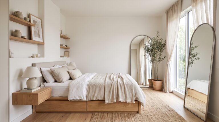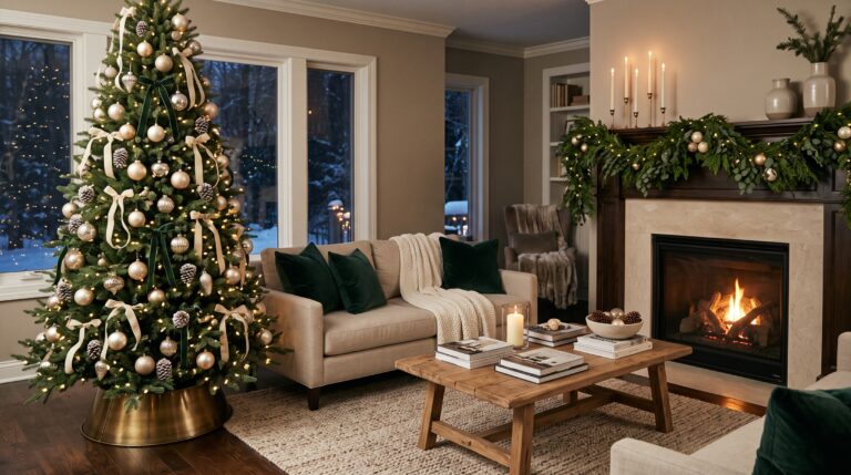

Every year, a new wave of colors lands on designers’ mood boards, and every year a handful of them end up on real walls. Some are loud, some are barely-there whispers, and a few always manage to surprise everyone. This season is no different. The 2026 paint color trends lean toward warmth, softness and personality, pulling away from the icy grays that dominated the last decade.
Think chocolatey browns that act like a new black, mushroom neutrals with a touch of mystery, smoky greens that feel like a day at the spa, polished jewel tones, and a very pale white that has the design world arguing in group chats. Whether you are planning a full-home makeover or simply want to refresh one tired room, there is a direction here for you.
Below, I walk through each palette, the specific paint shades worth sampling, and the rooms where each one works best. Grab a coffee, keep a notebook handy, and let’s get into it.
2026 Paint Color Trends Worth Knowing Before You Pick Up a Brush
Taken together, the 2026 paint color trends tell one clear story: people want their homes to feel like a refuge. After years of crisp, cool and clinical interiors, the palette has shifted toward colors that hug a room rather than simply fill it. Depth, undertone and the way a shade behaves in changing light now matter more than whether a color is technically “in.”
The five directions below cover the full range, from deep and dramatic to airy and minimal. You can commit to one, or mix a couple for a layered look. Each one carries real staying power, so you will not feel boxed in by a fad.
Trend 1: Rich Browns Step In as the New Black

For a long time, brown sat forgotten at the far end of the paint deck. Now it is back in a big way, and it looks nothing like the dated, muddy browns from decades ago. Today’s versions are deep, layered and quietly luxurious, the kind of color that makes a room feel instantly expensive and lived in at the same time.
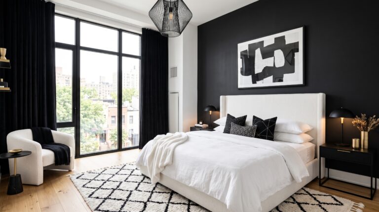
Benjamin Moore chose Silhouette (AF-655) as its Color of the Year for 2026, and it is a perfect example of the mood. It reads as a dark espresso with a hint of charcoal, so it feels grounded without turning heavy. If you want to explore more of this family, look at Benjamin Moore’s Bittersweet or Sherwin-Williams’ Dark Auburn (SW 6034), both of which bring a warmer, redder lean to the same concept.

Why is this shade catching on so fast? Largely because it answers years of cool, sterile gray. Brown wraps a space in warmth. It flatters wood tones, leather, linen and brass, and it makes lamplight glow instead of glare. Designers describe it as the neutral that finally has some soul.
Brown also adapts to many styles. In a living room, it pairs beautifully with cream upholstery, walnut tables and woven rugs. In a home office, a deep brown on the walls creates a focused, library-like feel. In a bedroom, it turns the whole space into a cocoon, especially when you add soft linens and low, warm lighting. Even a kitchen or dining area can carry it, with dark cabinetry, stone surfaces and bronze fixtures supporting the look.
A quick tip: dark colors reward good lighting. Use warm bulbs, layer in a few lamps, and avoid a single harsh overhead fixture. The paint will do the rest.
Trend 2: “Mushroom” Neutrals Give Beige a Moody Upgrade

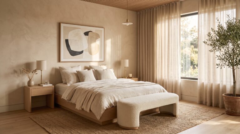
If you are tired of greige and the so-called sad beige era, meet the shade that is quietly replacing both: mushroom. This color family lives somewhere between taupe, beige and gray, but it carries subtle undertones of earth, stone and mist that make it feel far more interesting than a flat, safe neutral.
Greige tries to please everyone. Mushroom does not bother. It has a point of view, and that is exactly why rooms painted in it look curated rather than builder-grade.

The real magic is how these colors move through the day. A true mushroom neutral can lean slightly green in strong daylight, shift toward a mauve-gray in dimmer light, and settle into a warm, stony tone once the sun goes down. That constant change gives a wall dimension, and it is why the color feels custom even when it comes straight from a can.
Shades such as Gossamer Veil are good starting points, and Farrow & Ball’s well-loved Cornforth White also fits the mood nicely, offering a calm and grown-up backdrop for almost any room.
Mushroom works especially well in living rooms, bedrooms and entryways, where you want a serene base that supports everything else. Pair it with natural textures like bouclé, jute, pale oak and microcement, and the whole space settles into a relaxed, upscale rhythm. Because the undertones are so subtle, it also plays well with bolder accents, so you can bring in a rust throw or a deep green vase without any clash.
If you like the idea of a neutral with character, this is the easiest way to get there without taking a big color risk.
Trend 3: Green Heads to the Spa
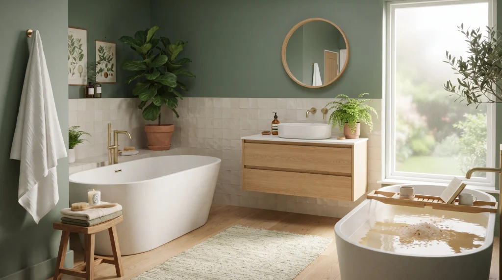
Green has been a favorite for several seasons, but in 2026 it has relaxed. Gone are the bright, leafy shades that shouted “jungle.” In their place are mineral, smoky and restorative tones that feel like a long exhale.
These newer greens are so flexible that they almost behave like neutrals. They sit comfortably next to wood, stone, white linen and brushed metal, and they bring a quiet link to the outdoors without feeling themed.
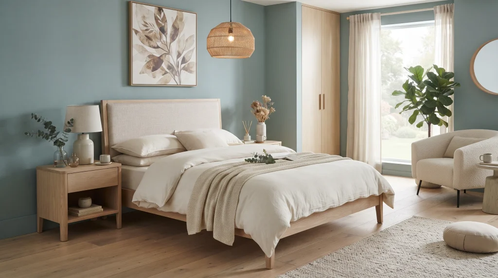
Behr named Hidden Gem (N430-6A) its Color of the Year, and it captures this direction well. It is a smoky jade that blends blue and green into a rich, calming hue. Valspar is moving in a similar direction with Warm Eucalyptus (8004-28F), a softer green with a slightly silvery quality that is meant to feel restful and welcoming. According to the brand, the shade draws on the familiarity of retro design and the comfort of nature, which explains its grounded, friendly feel.
Bathrooms are the obvious home for these tones, particularly when paired with light oak vanities, a freestanding tub and handmade tile. But they are just as lovely in bedrooms, where a eucalyptus wall behind a linen-covered bed makes mornings feel gentle. In a living room, a muted blue-green against ivory sofas and a limestone fireplace feels airy and sophisticated.
Here is a trick worth remembering: if you cannot decide between two similar greens, sample both. Then watch how each one behaves in the morning, at midday and in the evening. Green is famous for shifting with the light, and the shade that looks perfect at noon may turn muddy by dusk. A few days of observation can save you from repainting.
Trend 4: Jewel Tones Return, Now With Polish

Anyone ready to leave neutrals behind will love this one. Saturated jewel tones are back, but they have matured. Instead of flashy and loud, they now feel bold yet refined, creating rooms with real depth and personality.

The leading shades are wine-like plums, rich burgundies and earthy reds. Graham & Brown’s Divine Damson is a dramatic deep plum, Little Greene’s Adventurer is a grounded plum-aubergine, and Glidden’s Warm Mahogany brings a rich red-brown that sits comfortably between jewel tone and wood tone.
These colors shine in rooms built for connection. A dining room painted deep plum, for example, instantly feels intimate, especially with a walnut table, linen chairs and aged brass lighting. A reading nook in burgundy, with built-in shelves and a camel leather chair, becomes the kind of corner people fight over. Even a home office benefits, as a dark plum wall gives focus and a studious, almost academic feel.
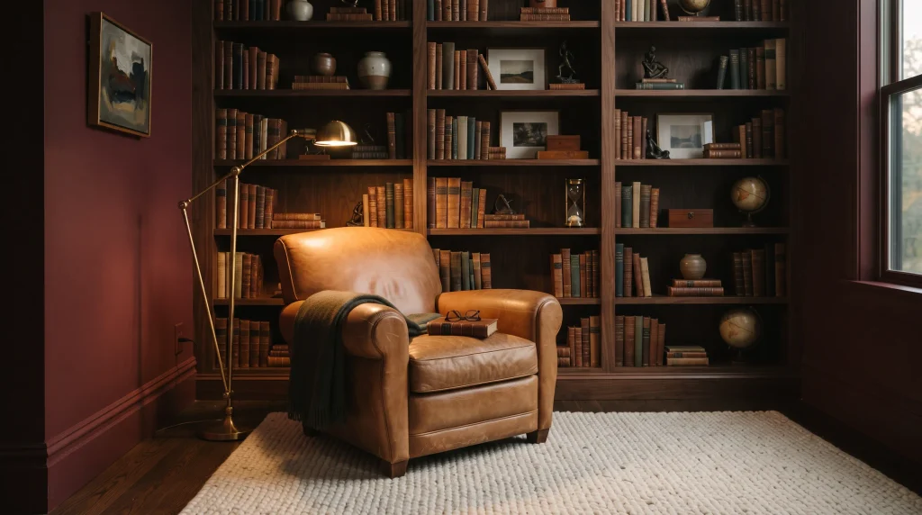
The trick to making jewel tones feel grown-up is restraint everywhere else. Keep the furniture simple, choose natural materials, and let the wall color carry the drama. Warm metals like brass and bronze add glow, while creamy whites and soft woods stop the room from feeling heavy.
If a full room feels like too much commitment, try one wall, a ceiling, or the inside of a built-in bookcase. A single saturated surface can change the entire personality of a space.
Trend 5: Cloud Dancer Turns White Into the Debate of the Year

Now for the most talked-about trend of all. Pantone, the best-known authority on color, named its 2026 Color of the Year, and the choice surprised plenty of people: PANTONE 11-4201 Cloud Dancer, a soft, lofty white.
Yes, it is white. Pantone positions it as a calming influence in a world that is rediscovering quiet and reflection. In interiors, that translates to a clean, airy backdrop meant to clear the mind, a visual deep breath for people with busy lives and busy homes.
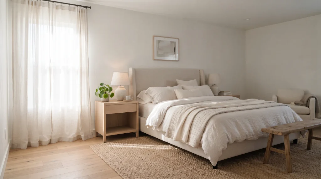
Reactions have been mixed. Some designers and homeowners love the idea of a fresh reset, a blank page that lets light, art and texture take center stage. Others feel it is a missed chance to celebrate the rich, soulful colors so many people are craving right now. Both camps have a point, and that tension is exactly what makes this trend so interesting.

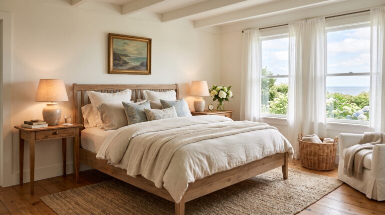
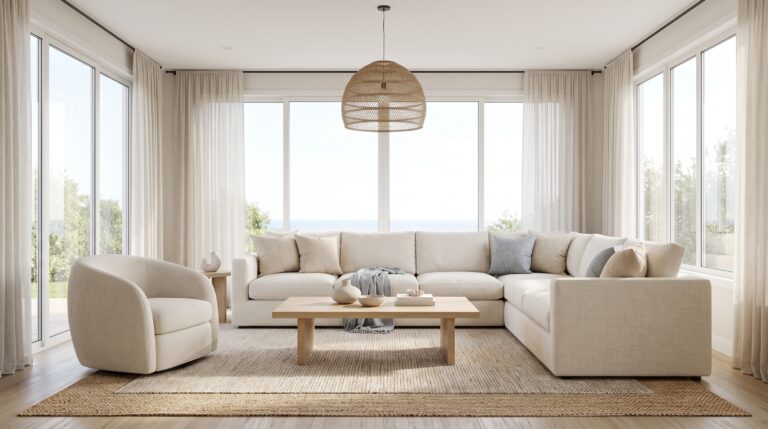
If you do want to try it, remember that white is never just white. Warm whites feel cozy and forgiving, while cooler ones can read stark and flat. In a living room, a soft white pairs well with an off-white modular sofa, pale oak floors and sheer curtains. In a kitchen, warm white cabinets with a stone island and gentle skylight glow feel bright without becoming cold. In a bedroom, ivory upholstery and ecru textiles keep the mood restful.
Layering is the secret. Mix several whites, add natural textures, and bring in a little wood or greenery to keep the room from feeling sterile. Handled well, this shade can feel serene rather than blank.
How to Test Any Color Before Committing
Paint looks different on a wall than it does on a tiny chip, so always test before you buy gallons. Brush large sample patches on at least two walls, and use poster board if you want to move the color around. Check it in the morning, afternoon and evening, and under both natural and artificial light.
Look at the color next to your floors, trim, curtains and furniture, because surrounding materials change how undertones read. Dark shades like brown and plum often look flatter in a store and richer in a real room, while pale shades like mushroom and white can swing warm or cool depending on the light. Give each sample a full day or two before you decide.
Finally, think about the feeling you want. A color should support how you live in the room, whether that means winding down, entertaining or concentrating on work. If you cannot picture yourself relaxing in the sample, move on. Keep a small notebook of favorites, photograph each patch at different hours, and ask a trusted friend for an honest opinion before you buy a single gallon of paint.
Final Thoughts
The 2026 paint color trends share one big idea: homes should feel good to be in. From cocooning browns and complex mushroom neutrals to spa-like greens, polished jewel tones and a debated white, there is plenty of room to experiment without losing your sense of style.
You do not need to follow every trend, and you certainly do not need to repaint the entire house. Start small, sample generously and choose the shade that makes you feel calm, cozy or confident when you walk through the door. Trends will keep changing, but a room that truly reflects you will always feel right. Whichever palette you choose, let natural light, good furniture and your own favorite objects finish the story, because paint is only the beginning of a truly beautiful, welcoming room that feels like yours.