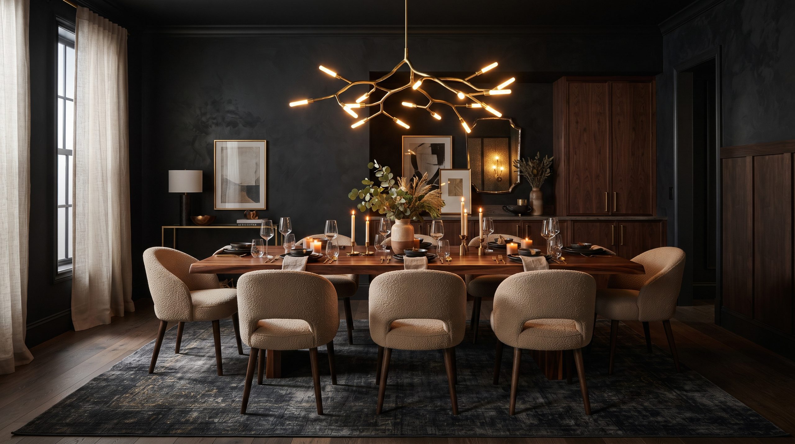
There’s a reason moody interiors keep showing up on every design lover’s inspiration board. A dimly lit restaurant with dark walls and candlelight has a way of making everyone at the table feel like they’re part of something special — and there’s no reason your own dining room can’t deliver that same feeling every single night.
A moody dining room isn’t about making a space feel dark or gloomy. It’s about layering depth, saturation, and texture so the room feels intentional, grounded, and a little dramatic. Whether you’re drawn to inky charcoal walls, a rich forest green, or a deep chocolate brown, this aesthetic bends to fit almost any home — from a sleek city apartment to a rustic farmhouse kitchen.
If you’ve been eyeing this trend and wondering where to start, here’s a complete breakdown of the styles, colors, and design choices that make a moody dining space work.
What Defines a Moody Dining Room
Before diving into specific looks, it helps to understand the core ingredients that make a moody dining room feel cohesive rather than chaotic. Three elements do most of the heavy lifting:
- Saturated color. Deep, low-light-reflectance hues — navy, charcoal, forest green, espresso — absorb light instead of bouncing it around, which is what creates that enveloping, cozy feeling.
- Contrast and texture. Dark walls need something to play against: a light wood table, woven chairs, brass fixtures, or a pale linen runner. Without contrast, a dark room can feel flat instead of rich.
- Warm, low lighting. Pendant lights, wall sconces, and candles do more work in a moody dining room than any other design element. Ambient, warm-toned lighting is what keeps the space feeling inviting instead of cave-like.
Once you’ve nailed those fundamentals, you can build almost any variation of the look. Below are the most popular directions to take it.
Layer Styles for an Eclectic, Collected Look
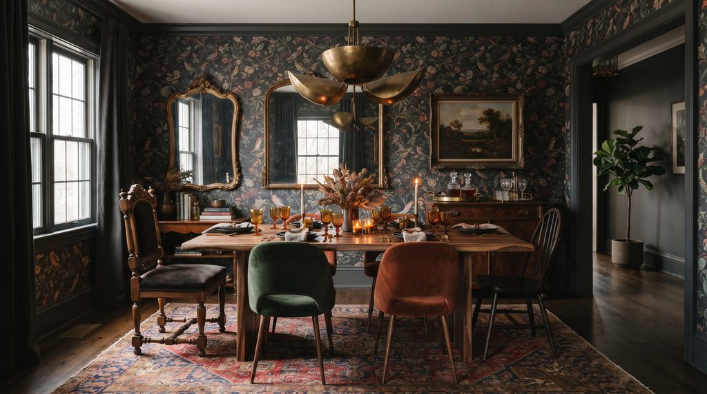
If committing to one single aesthetic feels limiting, an eclectic moody dining room might be the better fit. This approach mixes eras and finishes — a vintage rug under a modern table, glossy black chairs next to a matte wood buffet — while keeping the overall palette dark and cohesive.
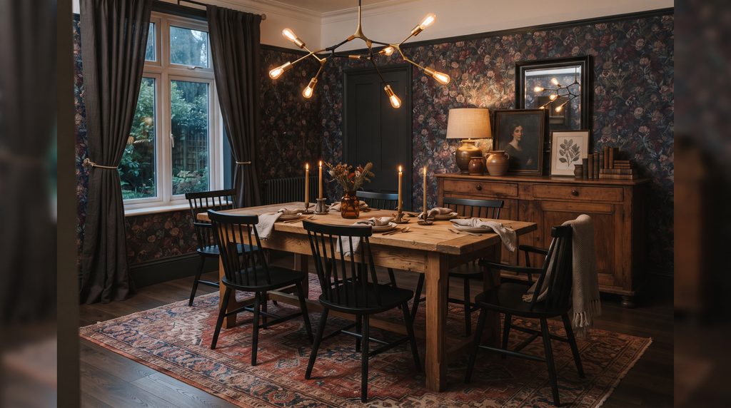
The trick to pulling off an eclectic mix without it looking cluttered is restraint with color. Stick to two or three deep tones plus a single lighter neutral to tie everything together, then let one standout piece — an oversized pendant light, a sculptural mirror, or a bold-patterned wallpaper — anchor the whole room. Botanical or floral wallpaper works especially well here, since it adds pattern without competing with your furniture choices.
Go Earthy with Deep Green Walls
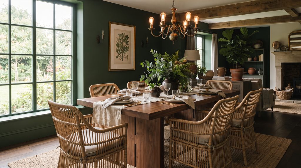
Dark green is one of the most forgiving moody colors because it reads as both dramatic and organic. A forest, hunter, or bottle green wall pairs beautifully with natural wood tones, brass hardware, and black accents, which is why it shows up so often in both traditional and modern dining rooms.
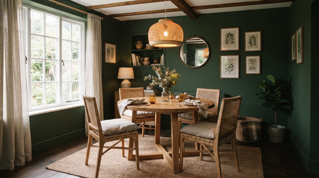
You don’t have to commit to floor-to-ceiling color, either — a single accent wall or painted wainscoting can deliver the same moody effect without overwhelming a smaller space. To keep the room from feeling too heavy, bring in woven textures like a jute rug, rattan chairs, or a linen tablecloth. These natural materials soften the saturation of the paint and keep the space feeling lived-in rather than staged.
Keep It Sharp with Charcoal and Gray
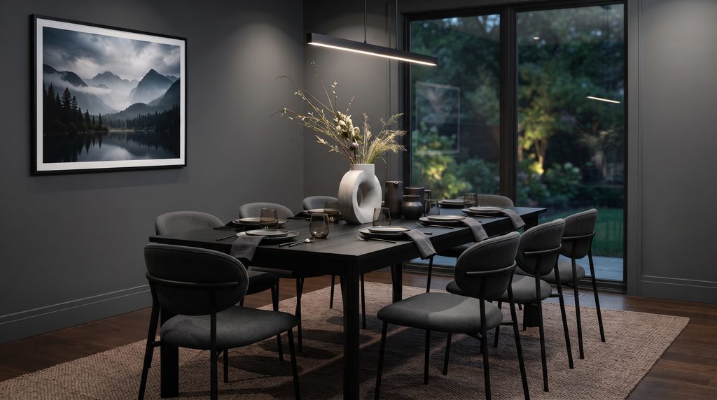
For anyone who wants moody without veering into rustic or cottage territory, charcoal gray is the cleanest way to get there. It reads as polished and modern, especially when paired with black metal furniture, matte finishes, and a tight, restrained color palette of black, white, and warm taupe.
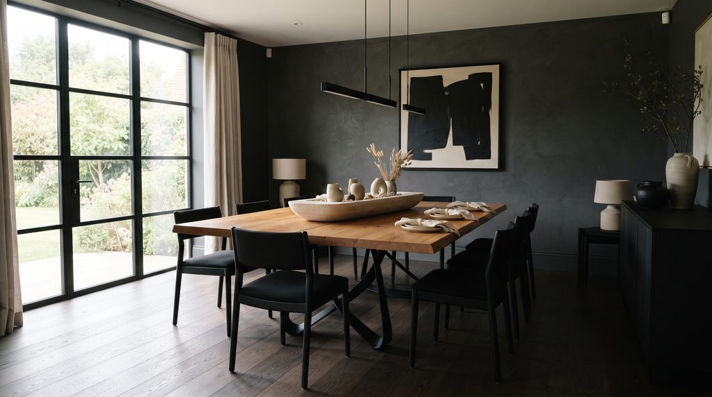
Because gray can occasionally feel a little cold, adding one organic texture — a concrete vase, a stone centerpiece bowl, or an unfinished wood tabletop — keeps the room from feeling sterile. This is also a great direction if your dining room gets a lot of natural light during the day, since charcoal tends to shift and soften depending on how the light hits it.
Blend Japandi Minimalism with Dark Tones
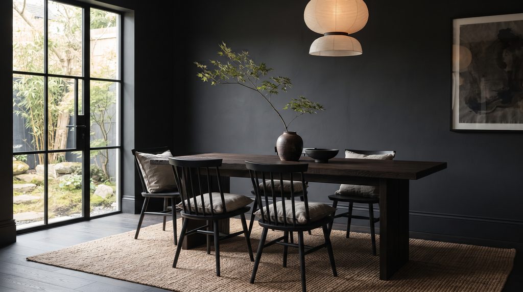
Japandi — the hybrid of Japanese and Scandinavian design — thrives on the tension between minimalism and warmth, which makes it a natural partner for moody color choices. Think dark wood paneling or a deep charcoal wall, balanced by soft, uncluttered furniture and a whole lot of negative space.
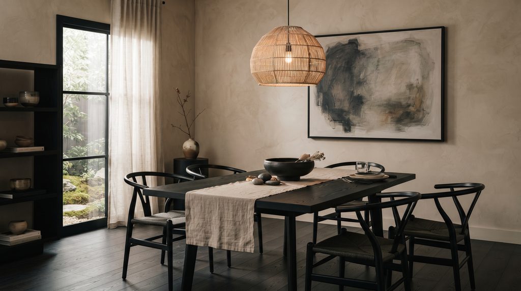
The key here is restraint. Choose black or dark wood furniture with clean, simple lines, then soften it with oatmeal or natural linen cushions and a few raw ceramic or rattan accents. Art should lean abstract or organic in shape rather than busy or ornate, echoing the calm, pared-back feeling that defines the style.
Let a Dark Marble Table Take the Lead
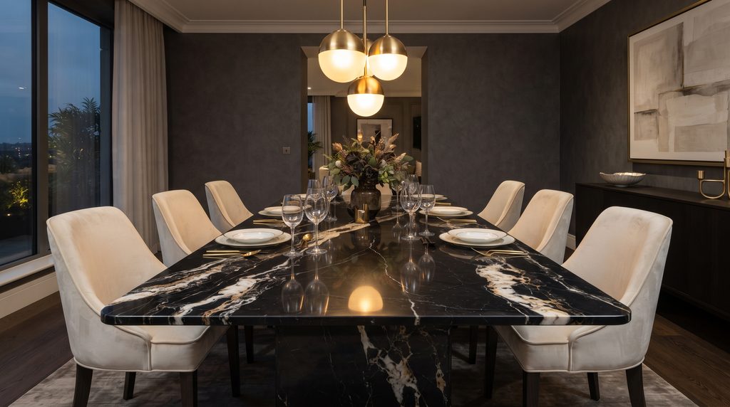
Sometimes the boldest move isn’t the walls — it’s the table. A dark marble dining table, whether in black, charcoal, or deep green with dramatic veining, instantly becomes the visual centerpiece of the room. When you go this route, it’s usually best to keep everything else relatively simple so the marble gets to do the talking.
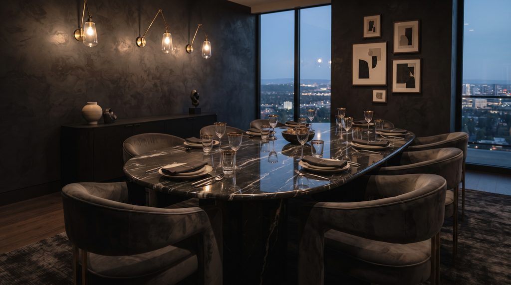
Pair it with quieter, more understated seating — a soft velvet or natural leather chair works well — and add warm, ambient lighting that reflects gently off the polished stone. This combination tends to feel more formal and glamorous, making it a strong choice for anyone who entertains often. Just budget for some maintenance: marble is porous, so coasters and placemats aren’t optional.
Commit Fully with Dark Wood Everywhere
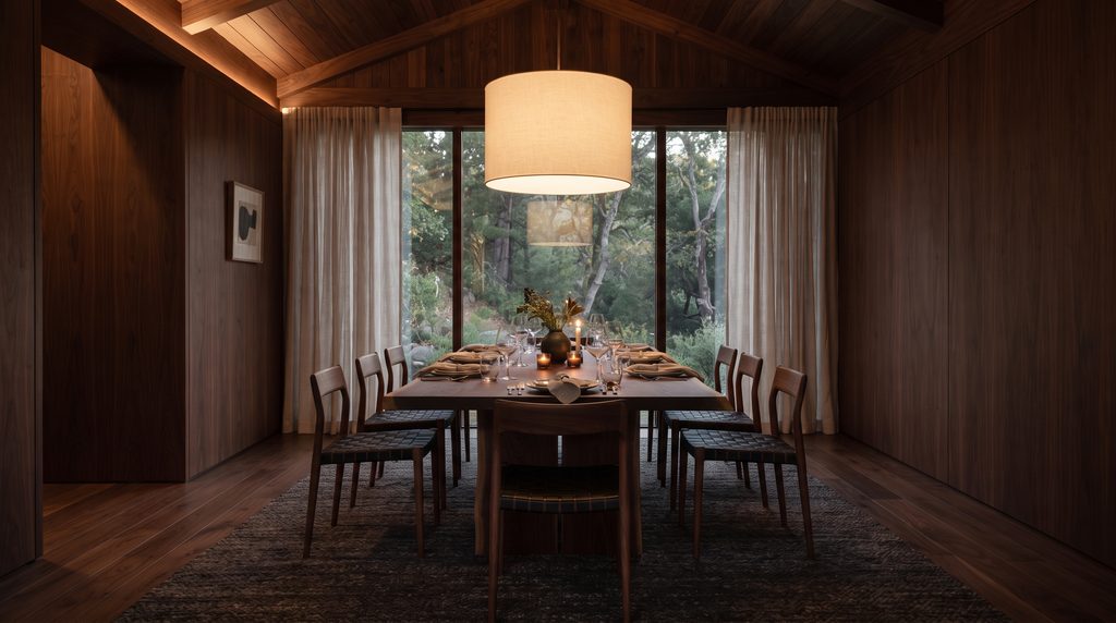
If you love the warmth of wood but want to push it into moody territory, try using a single deep wood tone — walnut, espresso, or black oak — across the table, chairs, and even the flooring. Used all together, dark wood creates an incredibly rich, cocoon-like effect.
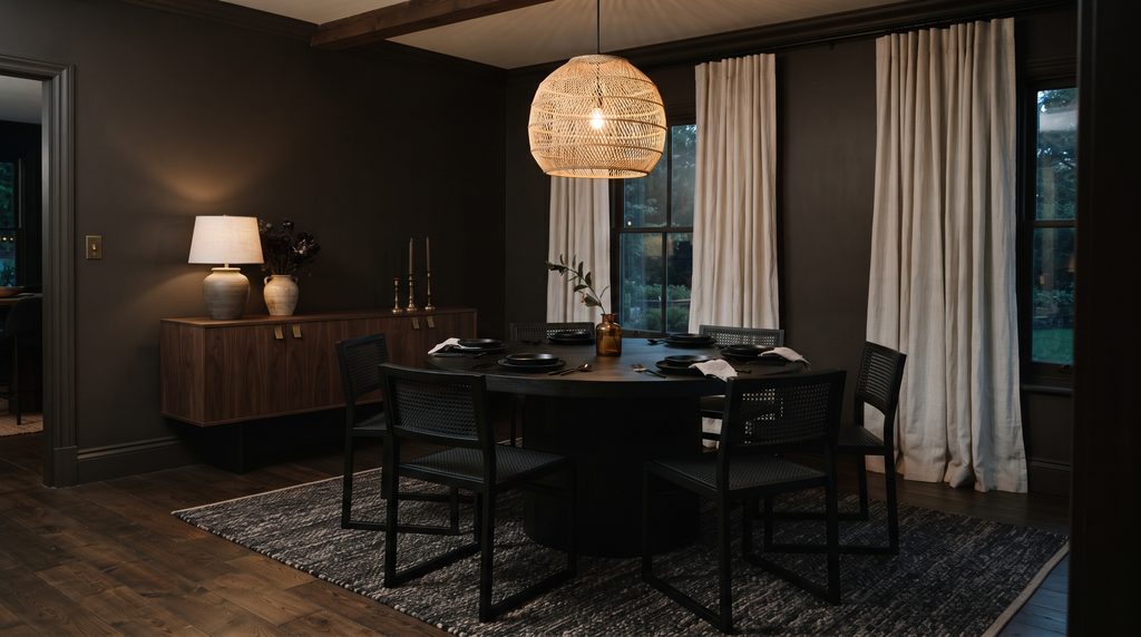
To keep it from feeling too heavy or dated, choose furniture with open, slender frames rather than bulky silhouettes, and break up the wood with lighter textiles like sheer curtains or a cream pendant shade. If you’re combining multiple wood tones in the same room, try to keep the undertones consistent — all warm or all cool — so the mix reads as intentional rather than mismatched. A dark, textured rug underneath the table helps ground the whole look.
Contrast a Dark Table with Light Seating
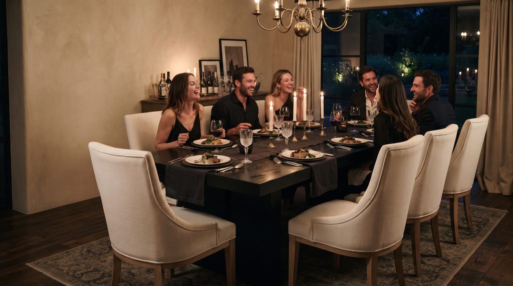
Not every moody dining room needs dark walls to feel dramatic. One of the simplest ways to bring in the aesthetic is to pair a dark tabletop with lighter chairs — think a black or espresso table surrounded by cream linen or bleached wood seating.
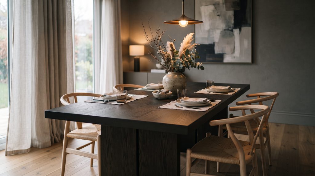
This approach adds visual weight to the table itself, making it the clear focal point of the room, while the lighter chairs keep the overall space from feeling too heavy. It’s an easy entry point if you’re not ready to commit to dark walls but still want that moody contrast.
Add Depth with Dark Blue Walls
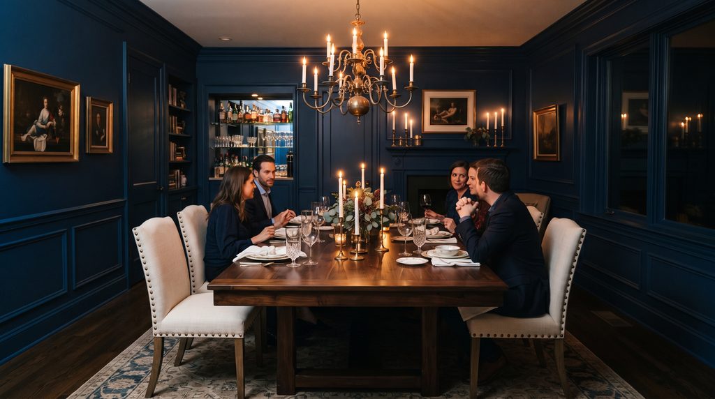
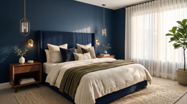
Navy and midnight blue are some of the most versatile moody colors because they work equally well in traditional, transitional, and modern spaces. You can go tonal — matching trim and ceiling to the wall color for an immersive effect — or add contrast with crisp white crown molding for a more classic look.
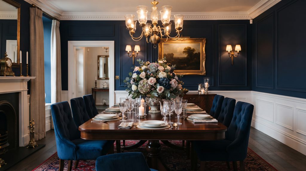
Brass or gold light fixtures play beautifully against a blue wall, and a velvet banquette or upholstered bench adds an extra layer of coziness. Blue also tends to photograph and feel slightly softer than black or charcoal, which makes it a good middle-ground option if you want drama without starkness.
Warm Things Up with Chocolate Brown
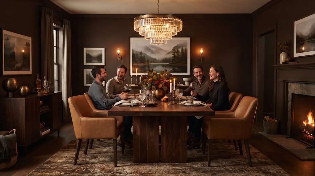
If black or gray feels too severe for your taste, chocolate brown might be the more comfortable version of moody. Rich espresso walls or brown furniture bring the same sense of depth without the starkness, and they tend to feel warmer and more grounded, especially in rooms with limited natural light.
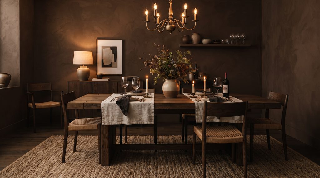
Stick to a tonal palette here — think leather upholstery, walnut furniture, and bronze or brass hardware — and use a textured rug or patterned curtain to add a little movement to the space. Dining rooms with lower light levels are actually a great candidate for this palette, since the warm brown tones make the room feel cozy rather than dim.
Try Deep Teal for a Colorful Twist
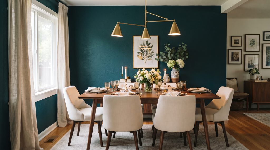
Teal offers a middle ground between the coolness of blue and the richness of green, making it a great option if you want color and drama without going fully neutral. A statement wall in a deep, saturated teal delivers plenty of atmosphere, while warm woods and mixed metals help balance out the coolness of the shade.
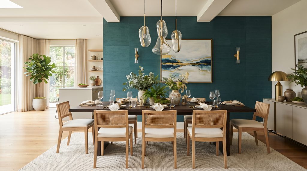
Layer in soft neutral textiles and a few natural materials — rattan, linen, unfinished wood — and the space will feel relaxed rather than overly saturated. Teal also tends to pair unexpectedly well with gold and floral accents, giving the room a slightly more eclectic edge if that’s the direction you’re leaning.
Add Texture with a Dark Boho Look
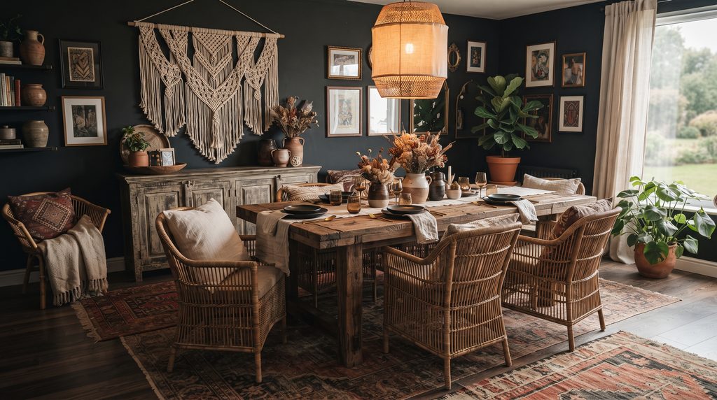
For a more relaxed, collected version of moody, boho styling leans hard into texture rather than color intensity. Dark-toned rugs, woven throws, and macramé wall hangings do most of the visual work here, layered over earthy materials like wood, ceramic, and rattan.
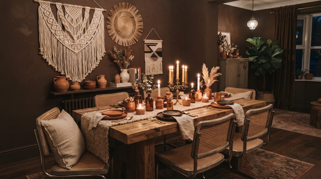
A great trick for this style is adding an oversized textile as wall art — it brings texture into the room, softens the acoustics, and gives the space a collected, well-traveled feeling that’s harder to achieve with typical framed art.
Go Rustic with a Moody Farmhouse Look
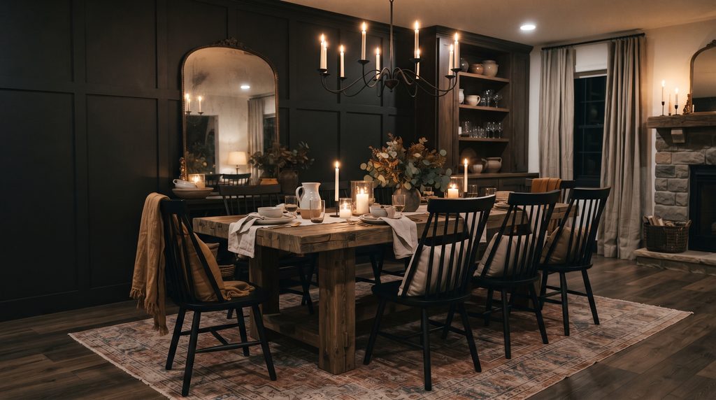
Modern farmhouse style and moody design pair surprisingly well together. Dark wood finishes combined with matte black metal accents create a look that feels both dramatic and welcoming — think a reclaimed wood table, black Windsor-style chairs, and iron pendant lighting or wall sconces.
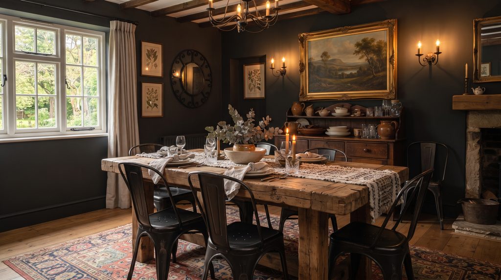
Linen and wool textiles bring in softness, while a table runner, vintage-inspired wall art, or an antique hutch add character without cluttering the space. Ambient lighting is especially important here; a shaded chandelier or warm sconces keep the farmhouse-moody combination feeling cozy rather than stark.
Final Thoughts
Moody design isn’t about making your dining room feel dark for the sake of it — it’s about creating depth, warmth, and a sense of occasion every time you sit down to eat. Whether you go all-in with a saturated wall color or ease into the trend with a single dark piece of furniture, the goal is the same: a space that feels rich, intentional, and a little bit dramatic.
If you’re ready to start testing shades, Benjamin Moore’s curated collection of moody paint colors is built around deep jewel tones like amethyst purple, emerald green, and sapphire blue, designed to bring a luxurious, atmospheric feel to a room — a solid starting point before you commit to a full gallon. benjaminmoore