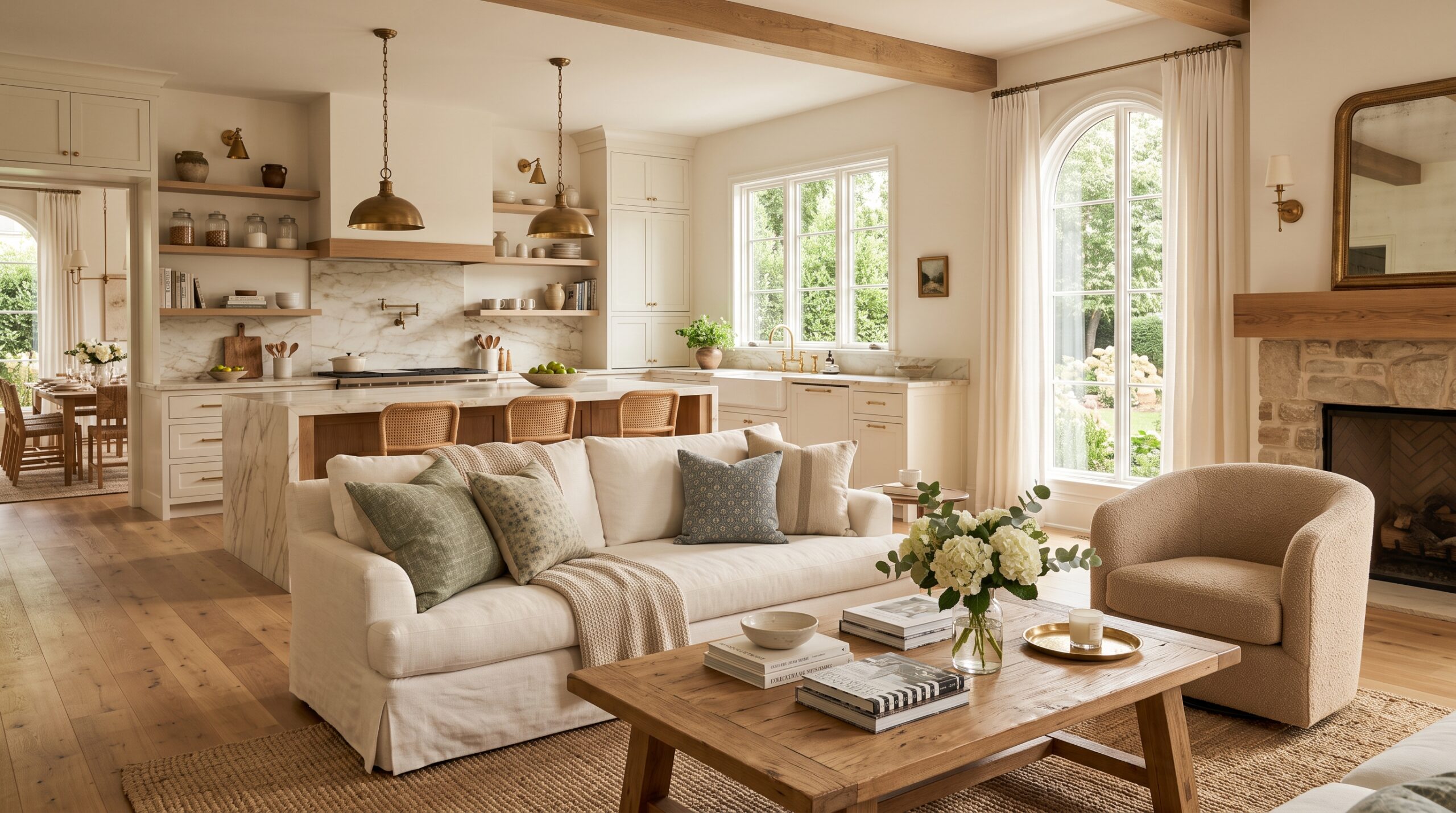
If you’ve ever paused a rom-com just to stare at the nancy meyers color palette ideas instead of following the plot, you already understand the pull of a Nancy Meyers interior. Her films — Something’s Gotta Give, The Holiday, It’s Complicated, Father of the Bride — are famous for houses that feel like main characters in their own right. They’re airy, layered, lived-in, and quietly luxurious, and almost none of that comfort comes from bold color choices. It comes from restraint: soft neutrals, natural textures, and colors that never shout for attention.
Design writers have pointed out that this isn’t just a movie trick. Meyers’s own real-life home, profiled in a House Beautiful roundup on the trend, leans on the same calm, collected palette she uses on set, instead of chasing whatever’s trending that season. That’s part of why this look has stuck around for decades and why it keeps resurfacing on Pinterest and TikTok with millions of new fans every year.
Below are 22 Nancy Meyers–inspired color combinations you can borrow for your own home, whether you’re repainting one accent wall or planning a full room-by-room refresh. Each one leans on the same idea: a soft neutral foundation, one supporting color, and plenty of natural texture to keep things from feeling flat.
Nancy Meyers Color Palette Ideas for Every Room
1. Cream and Soft White
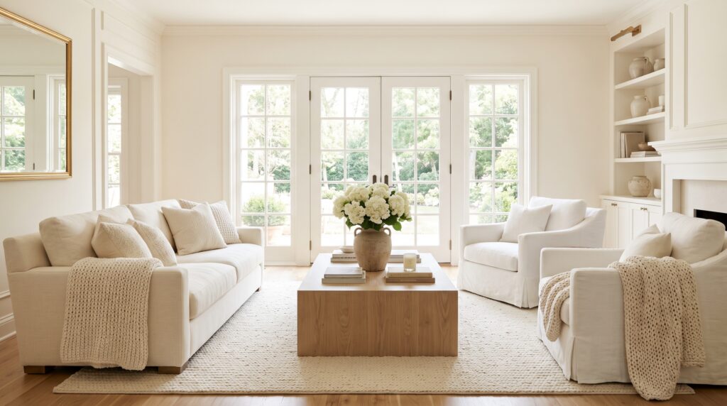
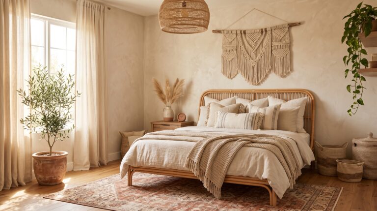
This is the pairing that started it all, and it’s still the most recognizable Meyers signature. Creamy walls, ivory upholstery, linen drapery, and layered textured throws create that soft, glowing look you see in almost every one of her interiors. It’s forgiving, easy to live with, and works in nearly any room, but it’s especially lovely in living rooms and primary bedrooms where you want brightness that still feels warm rather than stark or clinical.
2. Beige, Taupe, and Oak
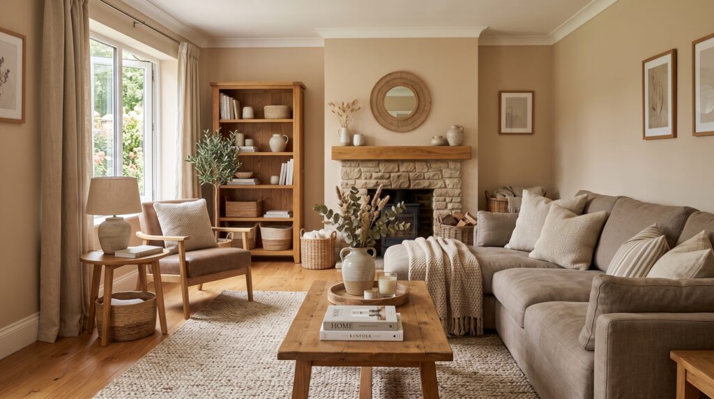
Warm beige walls next to taupe seating and honey-toned oak furniture give a room quiet confidence without trying too hard. Add woven baskets, linen cushions, and a handful of simple neutral accessories, and you get real depth without visual clutter. This is the palette to reach for if you want a room that feels sophisticated the moment you walk in but never feels stiff or overly formal.
3. Soft Blue with Cream
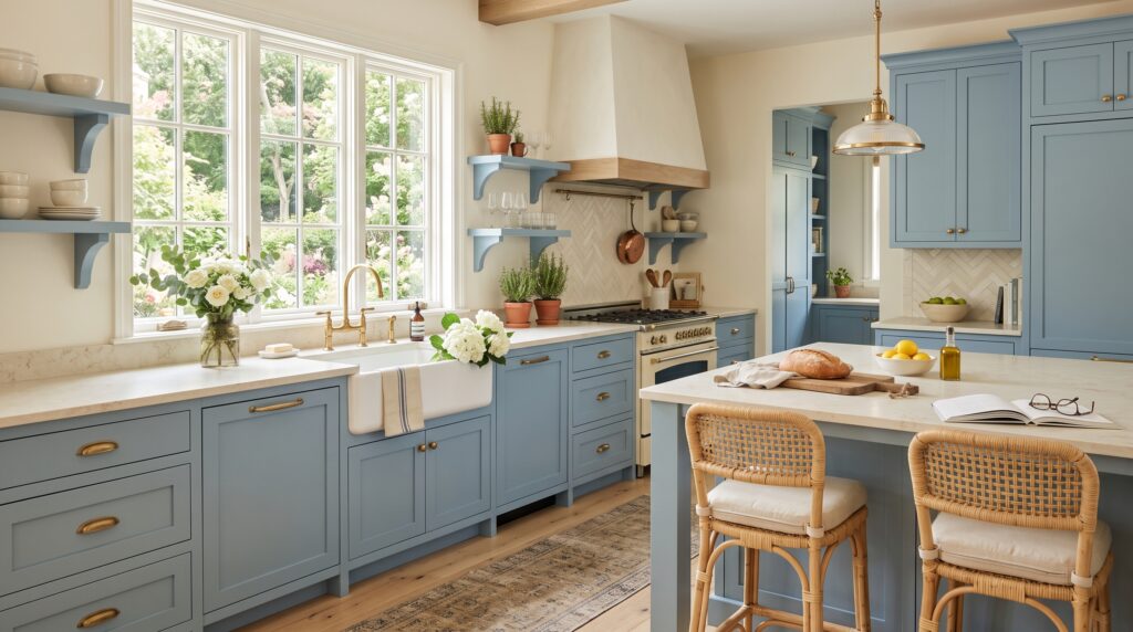
A gentle, faded blue paired with cream brings a sense of coastal calm into a kitchen or bathroom without leaning into full nautical territory. Picture dusty blue cabinetry set against pale cream countertops and crisp white trim. It reads as fresh and clean rather than beachy, and it photographs beautifully in natural light, which is exactly why it shows up so often in Meyers’s sun-drenched kitchen scenes.
4. Sage Green and Warm Neutral
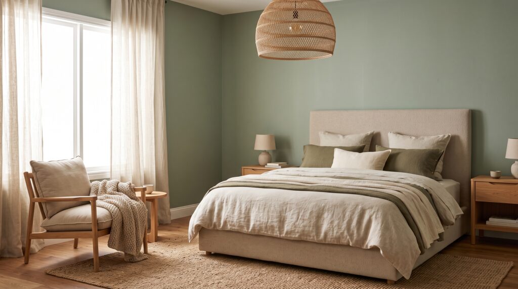
Muted sage brings the outdoors in without tipping into anything trendy or overly saturated. Combine it with beige textiles, natural wood furniture, and a few antique-style accents for a grounded, restorative palette. It’s a particularly good fit for bedrooms, home offices, and reading nooks, where a slightly quieter, more contemplative mood makes the space easier to actually relax in.
5. Navy Blue with Soft White
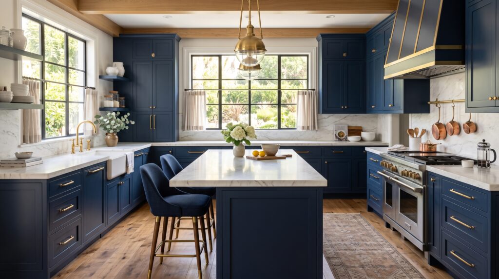
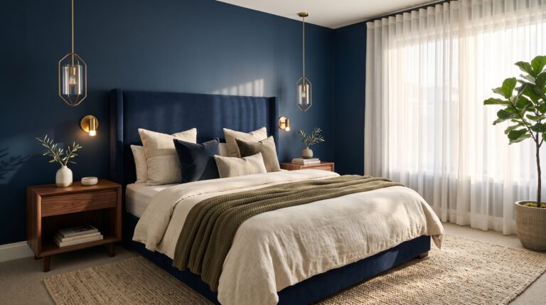
Navy adds structure and a touch of drama, especially when it’s used on cabinetry, an accent wall, or upholstered furniture. Balanced against soft white linens and warm wood tones, it stays classic instead of cold or heavy-handed. It’s a favorite trick for kitchens and studies that need a little more visual weight without losing that comfortable, welcoming feel.
6. Greige with Texture
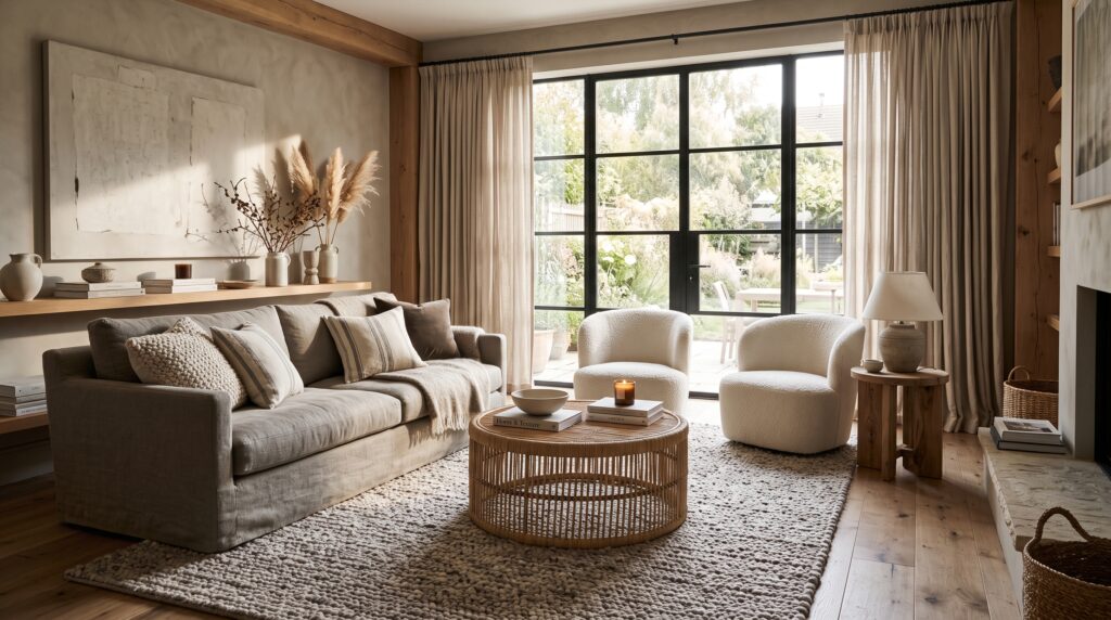
Greige — that in-between gray-beige hybrid — is one of the most versatile neutrals you can build a room around, but it needs texture to avoid reading as flat or lifeless. Layer in wool rugs, linen slipcovers, rattan furniture, and a mix of wood tones to keep the space feeling collected rather than showroom-perfect. Done right, it’s calm, elegant, and surprisingly easy to update over time.
7. Butter Yellow and Cream
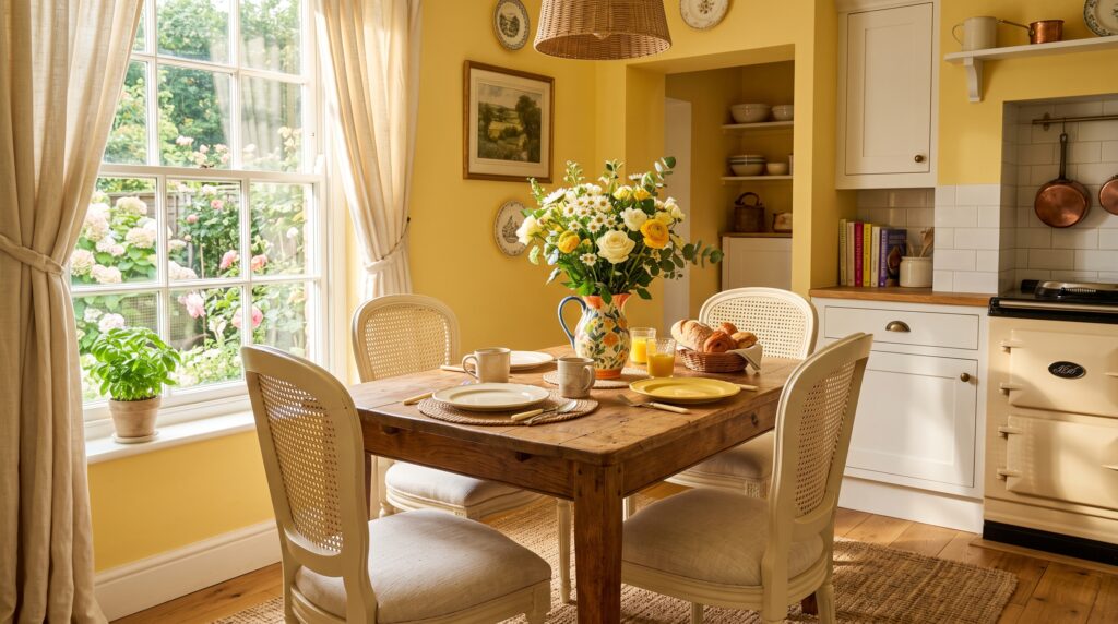
A soft, buttery yellow is warm and cheerful without being loud or overwhelming. Paired with creamy whites, natural wood tones, and a few vintage-inspired accessories, it brings genuine personality to a kitchen or breakfast nook. This combination has a nostalgic, almost old-Hollywood charm that fits perfectly with the sunny, optimistic mood so many of Meyers’s kitchen scenes are known for.
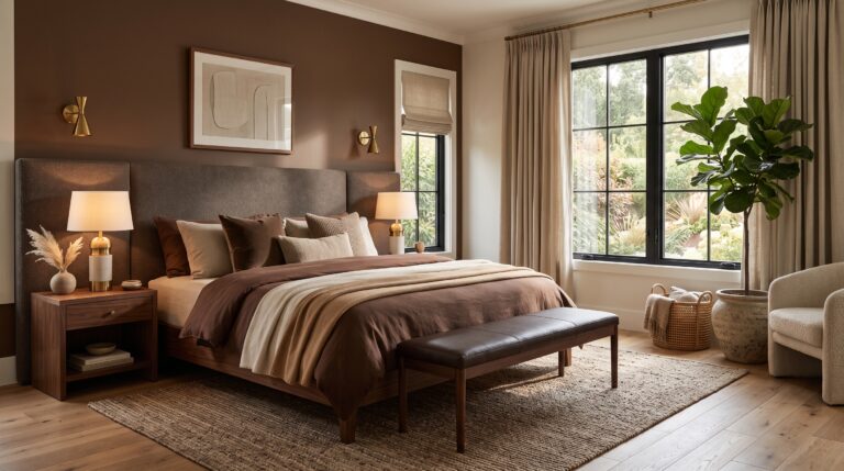
8. Chocolate Brown and Ivory
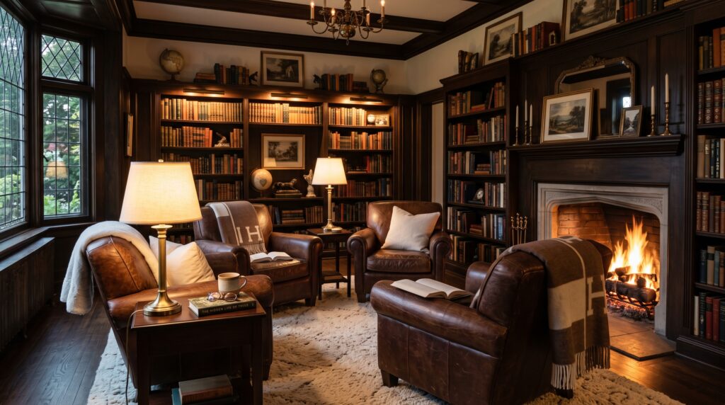
Rich brown leather chairs and dark wood furniture, set against ivory rugs and soft, warm lighting, create a cozy, grounded space that feels intimate rather than dark. This is the kind of den or library where you’d expect to find a Meyers character curled up with a book and a glass of wine. It works especially well in smaller rooms that benefit from a bit of enveloping warmth.
9. Soft Gray and Warm White
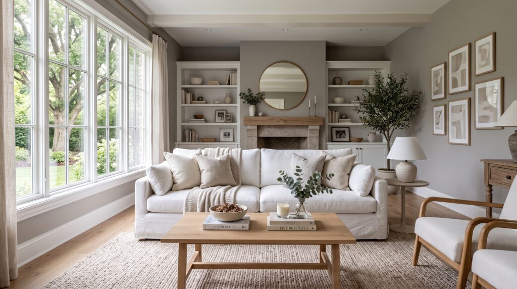
Skip cool-toned gray and reach for a warmer shade instead — it makes all the difference between a room that feels sophisticated and one that feels sterile. Paired with warm white trim, linen furniture, and natural wood accents, this combination gives you a peaceful, modern-but-timeless backdrop that works in almost any room of the house, from hallways to home offices.
10. Olive Green and Natural Linen
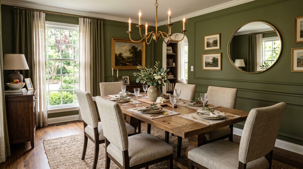
Olive adds real character while still staying sophisticated and easy to live with. Try it on cabinetry, an accent wall, or a statement sofa, then soften it with natural linen fabrics, warm wood furniture, and cream accessories. It’s an excellent choice for dining rooms and kitchens that want a bit more personality than a standard neutral palette without losing that relaxed, gathered-around-the-table feeling.
11. Coastal White and Sand Beige
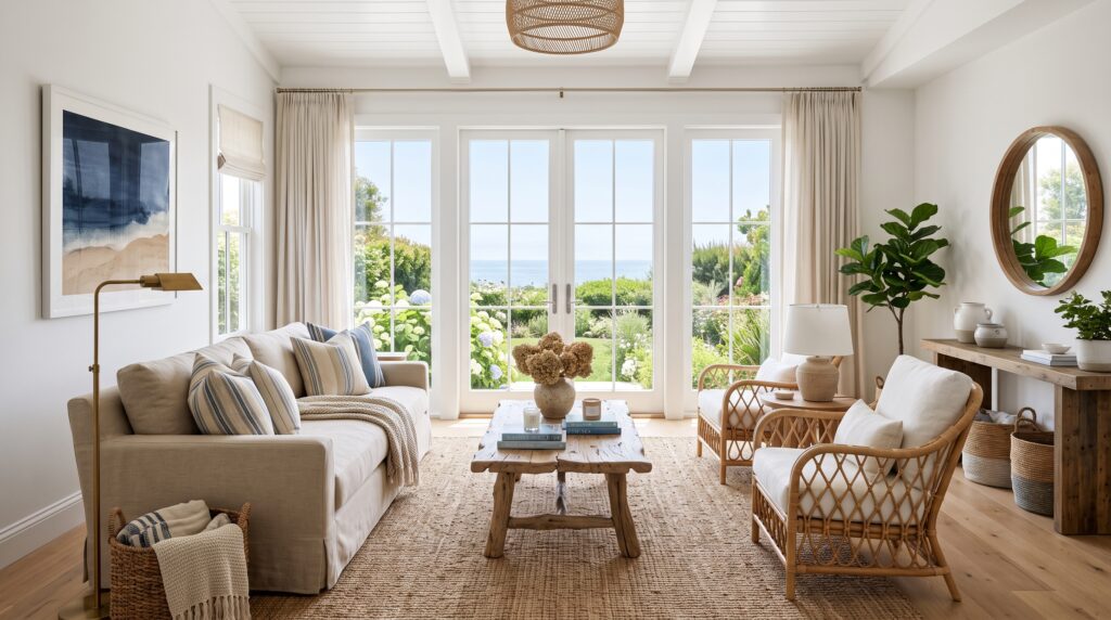
White walls paired with sandy beige furnishings and woven textures create a breezy, sunlit feel that makes rooms look larger and airier than they actually are. This combination leans coastal without being kitschy — no anchors or stripes required. It’s a natural fit for entryways, sunrooms, and any space where you want the light to feel like it’s doing most of the decorating.
12. Terracotta and Cream
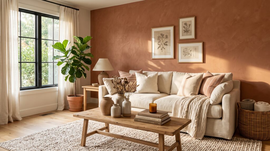
Terracotta brings genuine earthy warmth into a room without overwhelming it, especially when it’s balanced against cream walls, natural wood furniture, and handmade ceramic pieces. It’s a subtle, low-risk way to add personality and warmth to an otherwise neutral room, and it pairs particularly well with woven textiles and a few well-chosen vintage or artisan-made accessories.
13. Charcoal Gray with Cream
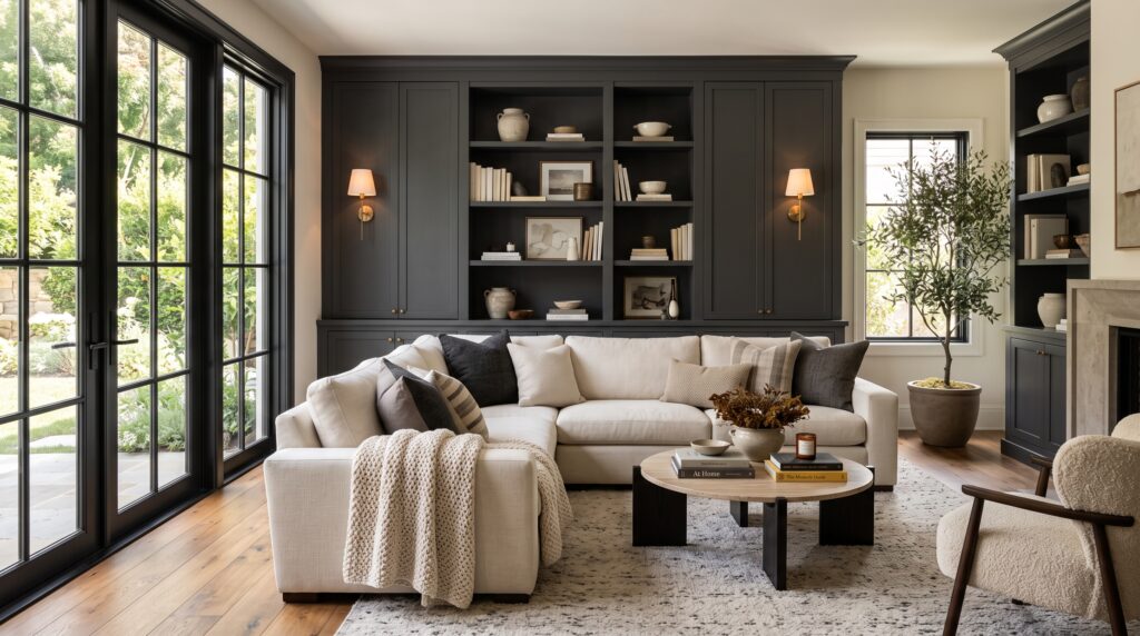
Charcoal introduces real drama and sophistication, especially when it’s used on furniture, cabinetry, or a single accent wall. It needs cream fabrics, soft textiles, and warm lighting around it to stay comfortable rather than heavy or cold. This is a strong choice for a modern-classic living room that wants a bit more visual punch without losing the cozy, inviting quality that defines the whole Meyers look.
14. Dusty Rose and Warm Neutrals
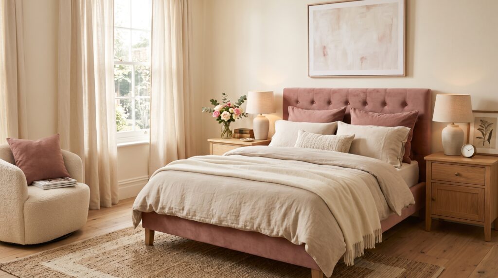
A muted, dusty pink brings softness into a room without feeling overly sweet or precious. Combined with beige furniture and cream fabrics, plus a touch of natural wood, it works beautifully in bedrooms or a small cozy sitting corner where you want a hint of romance. It’s subtle enough that it never feels like a “pink room,” just a warmer, gentler neutral space.
15. Forest Green and Warm Wood
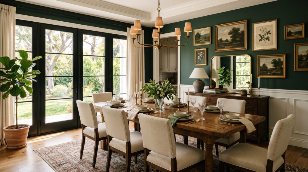
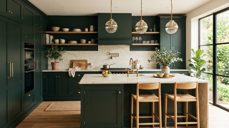
Deep forest green on cabinetry, paneling, or an accent wall, paired with cream textiles and a few brass details, creates a rich, classic look with real depth. It’s a strong choice for studies, dining rooms, or entryways — spaces that benefit from a bit more color confidence while still keeping the overall mood warm, grounded, and timeless rather than trendy.
16. Champagne Beige and Gold
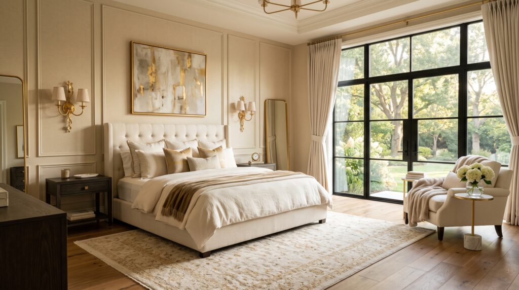
Champagne beige is a softer, more luxurious take on a standard neutral, and it pairs beautifully with small gold touches through lighting fixtures, mirrors, and hardware. The combination brings warmth and polish without ever feeling excessive. It’s an especially good fit for primary bedrooms or a formal sitting room where you want the space to feel a little special every day, not just on occasion.
17. Soft Black and Warm Neutrals
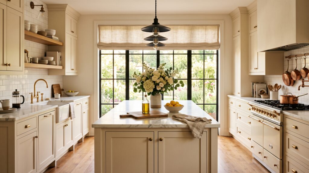
Matte black, used sparingly on trim, fixtures, or furniture, adds unexpected drama when it’s balanced with plenty of cream and beige around it. It’s a slightly more modern twist on the classic Meyers palette, but it still keeps the overall feeling warm and welcoming rather than stark. Think of it as the smallest possible dose of contrast in an otherwise soft, neutral room.
18. Light Lavender and Cream
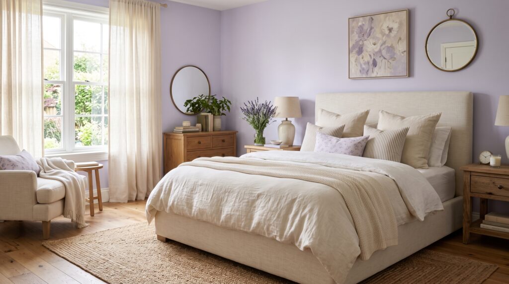
A whisper of lavender against creamy whites and natural wood creates a peaceful, slightly romantic retreat that never feels overdone. It’s a lovely, understated option for a primary bedroom or a small powder room that wants a bit of softness and personality without straying too far from the neutral foundation that ties the rest of the home together.
19. Mushroom Brown and Ivory
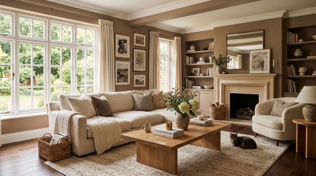
Mushroom is a quiet, sophisticated neutral that reads as far more interesting than plain beige once you actually live with it. Pair it with ivory accents, natural wood furniture, and soft ambient lighting for a collected, effortlessly stylish room. It’s a great option if you want a space that feels curated over time rather than decorated all at once.
20. Pale Green and White
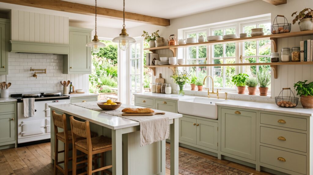
This combination gives a kitchen that timeless, farmhouse-adjacent warmth people are always chasing — soft green cabinets, white countertops, open wood shelving, and a handful of natural accessories. It’s fresh, bright, and exactly the kind of kitchen you’d expect to see a Meyers heroine cooking breakfast in while the morning light pours through an oversized window.
21. Warm Caramel and Cream
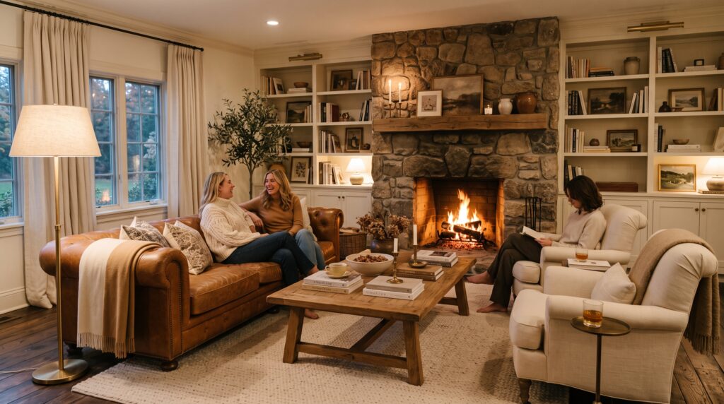
Caramel leather furniture and warm wood details, softened with cream textiles and plenty of soft lighting, create a cozy gathering space that still feels genuinely put-together. It’s an ideal palette for a living room built for long conversations, holiday gatherings, and the kind of lived-in comfort that makes a house feel like an actual home rather than a showroom.
22. Ivory and Natural Stone
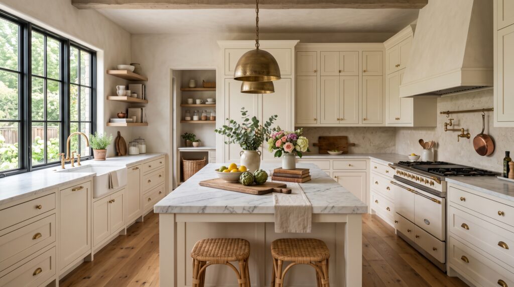
Limestone-inspired stone tones set next to ivory walls, natural wood furniture, and soft fabrics give a refined, relaxed kind of elegance. It’s a palette that photographs like a European villa but still feels comfortable enough for everyday life — perfect for kitchens, bathrooms, or entryways where you want the materials themselves, rather than paint color, to carry most of the visual interest.
Bringing It All Together
What ties every one of these Nancy Meyers color palette ideas together isn’t a single specific shade — it’s restraint. Nearly all of them lean on a soft neutral base, whether that’s cream, beige, soft white, or a warm gray, and then layer in one supporting color through cabinetry, furniture, or accessories, rather than reaching for several bold choices at once. The goal is a home that feels calm, collected, and a little indulgent, never like it’s trying too hard to impress anyone.
If you’re planning a refresh, it helps to start small. Pick one palette from this list, apply it to a single room, and then lean heavily into natural materials — linen, wood, wicker, and stone — to do the rest of the heavy lifting. That’s really the secret behind every dreamy Meyers interior: fewer bold color decisions, more texture and layering, and colors soft enough that you’ll still love them in ten years.
Save this list for your next painting project or full home refresh, and come back to it any time you need a fresh, cozy direction. Whether you’re drawn to a moody charcoal-and-cream study or a sun-washed pale green kitchen, there’s a Nancy Meyers–inspired palette here for practically every room in the house.
One last tip worth remembering: you don’t need to commit to a whole-house overhaul to get this look. Start with paint samples on your actual walls, live with them for a few days in different light, and choose fabrics and furniture in person whenever you can, since neutrals shift dramatically depending on the light around them. Small, patient choices, layered over time, are exactly how these effortlessly comfortable, timeless rooms come together in real life.